How to Explore Data Before Analysis
What exploring data means, the minimum steps to take with any new dataset, and how to use Frequency, Summary Statistics, and Cross-Tabulate in AnalyZ Solutions to build a reliable understanding before formal analysis begins.
The most common reason an analysis produces unreliable results is not a wrong statistical test or a misconfigured model. It is starting formal analysis without understanding the data first. Exploring a dataset before analysing it takes a few minutes and prevents hours of backtracking later.
01What does exploring data mean, and why does it matter?
Exploring data means building enough familiarity with a dataset to make good analytical decisions. It is not the same as cleaning data, which changes the data. Exploration is read-only: you are looking at the data, not modifying it. The two activities naturally follow each other. Exploration identifies what needs to be fixed, and cleaning fixes it. But doing them in the right order matters. Cleaning a variable you have not yet looked at risks introducing errors you may not notice until later.
Skipping exploration is one of the most common reasons analyses go wrong. A mean calculated on a variable with 40% missing data describes only the respondents who answered. A frequency table that treats a "not applicable" code as a real response distorts every percentage it contains. A variable recorded as a number but representing named categories, like a district code or a Likert scale, behaves incorrectly in tests designed for numeric measurements. None of these problems are obvious. They show up later, in results that are harder to interpret and sometimes impossible to trust.
Exploration does not need to take long. A structured approach covering a few key checks can give you a reliable picture of any dataset in minutes and is almost always worth it.
02What should you do when you receive a new dataset?
Four tasks, in this order, give you a reliable baseline understanding of any dataset before analysis begins. They take minutes and apply regardless of the size, source, or subject matter of the data.
Step 1 — See what variables you have
Start by reviewing what the dataset contains. How many variables are there? What are they called? Are any variables missing entirely? Are there columns with no label or with unclear names? This initial review also gives you a sense of completeness before you look at any individual variable in detail.
Step 2 — Check data quality
Scan every variable for three types of problem: missing values, constant variables where every row holds the same value, and statistical outliers. A systematic quality check produces a variable-by-variable report of these issues so you know what needs attention before analysis begins.
Step 3 — Verify variable types
Most analytical tools classify variables automatically, treating numeric columns with many distinct values as continuous and others as categorical. This classification controls which statistical methods can be applied to each variable. It is worth checking that every variable has been classified correctly. A Likert scale coded 1 to 5 should be categorical. A district identifier stored as a number should be categorical. An age variable should be continuous.
Step 4 — Explore the distribution of your key variables
For the variables that matter most to your analysis, such as outcomes, grouping variables, and key demographics, look at how the values are distributed. For categorical variables, check which categories exist, how common each is, and whether any are so rare they may need to be combined. For numeric variables, check where the values cluster, how spread out they are, and whether the distribution is skewed. Visualization is one of the most effective ways to do this. A histogram shows the shape of a numeric distribution in a way that mean and SD alone cannot. See Choosing the Right Chart Type for guidance on which chart works best for each situation.
03How to Do It in AnalyZ Solutions
3.1Seeing what variables you have — Column details
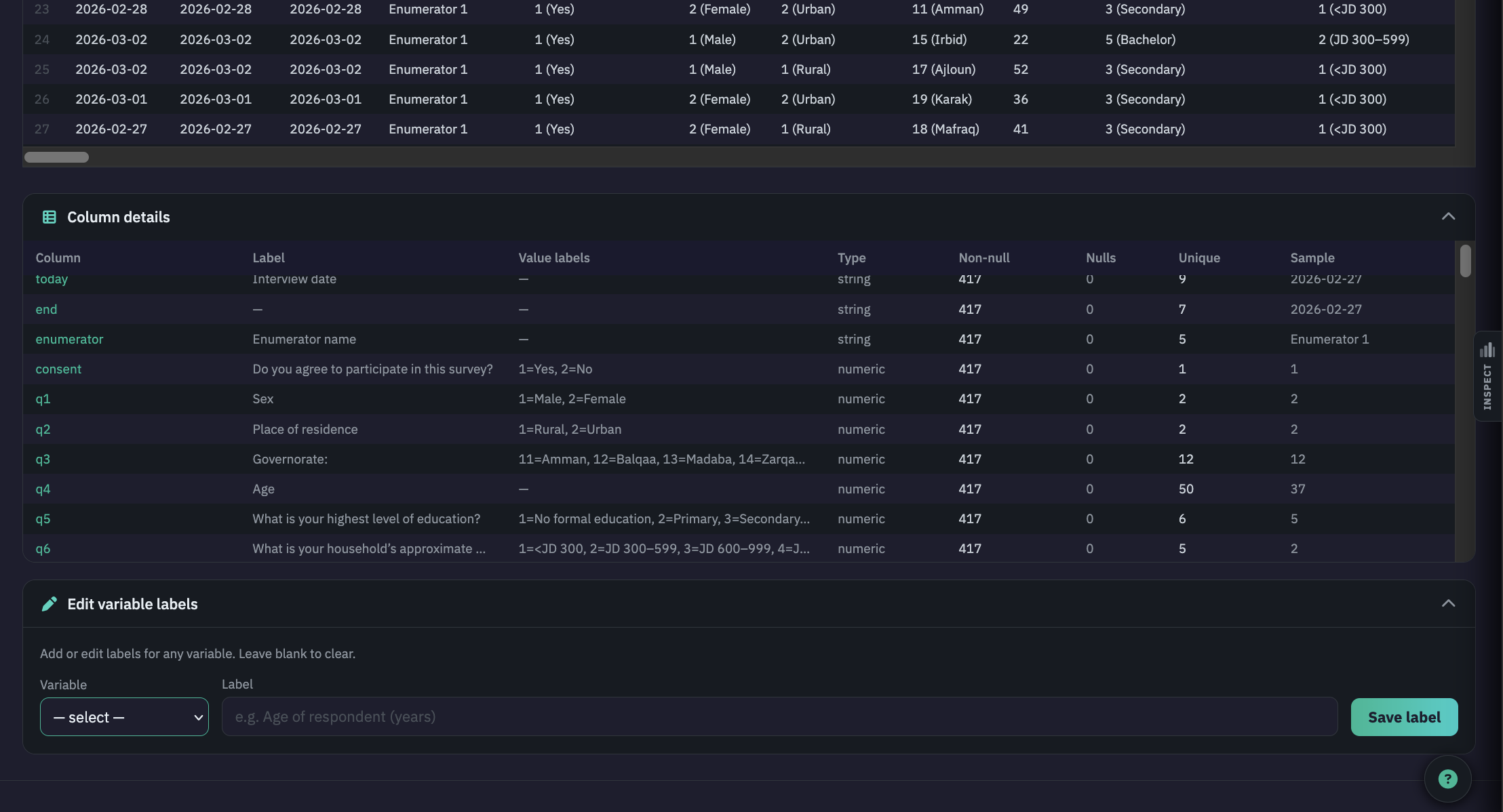
In Data View, the data table shows the full dataset. Use the row range slider at the top to jump to a specific section of a large dataset. Click Column details below the table to expand the variable inventory. Each row includes:
- Column — the variable name as it appears in the file.
- Label — the variable label, if defined.
- Value labels — a preview of value-to-text mappings, such as 1 = Male, 2 = Female.
- Type — numeric or string (text).
- Non-null / Nulls — count of rows with and without a value.
- Unique — number of distinct non-missing values.
- Sample — the first non-missing value in the column, as a quick sense-check.
3.2Inspecting any column — the Column Inspector
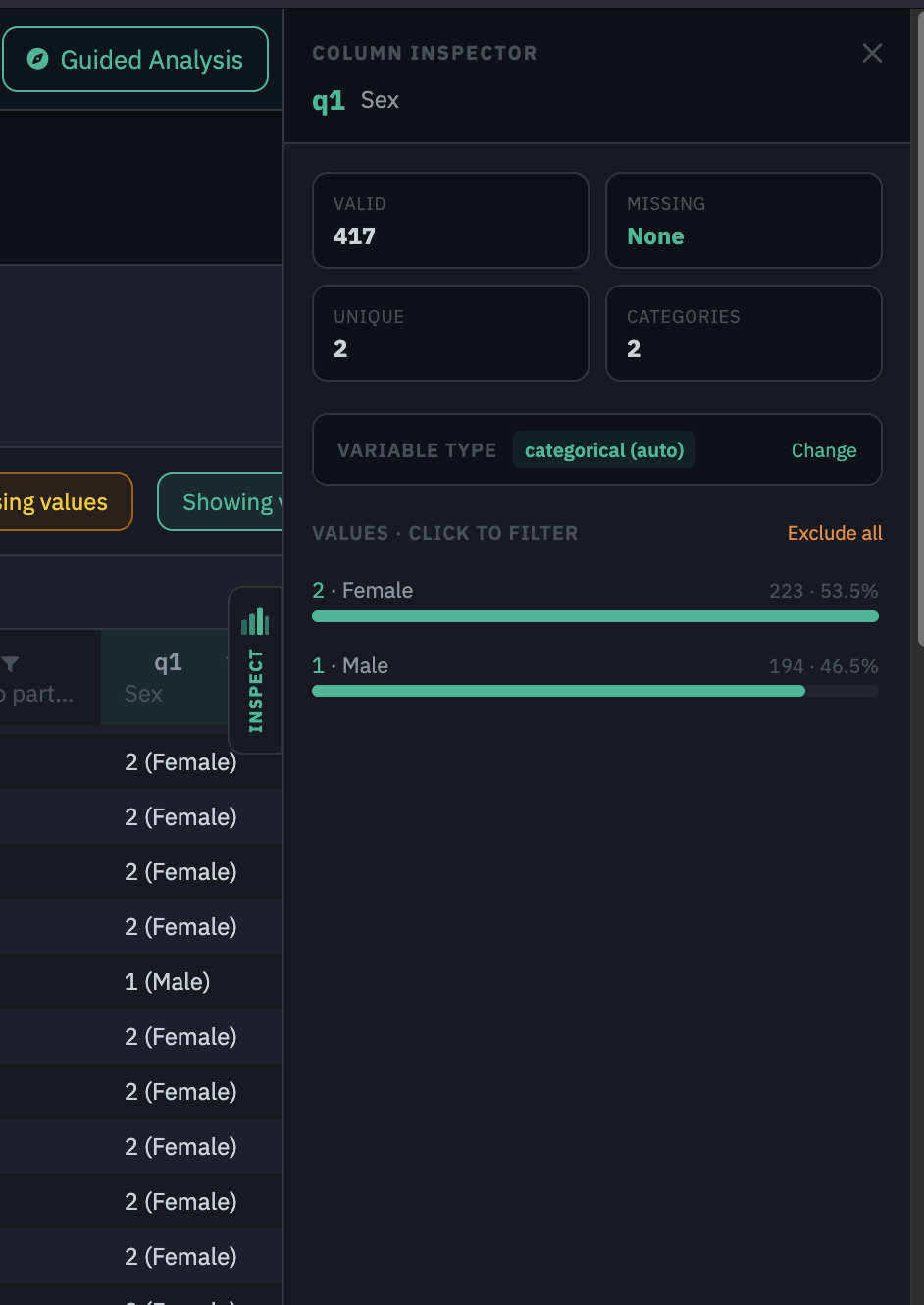
Click any column header in the data table to open the Column Inspector, a panel that slides in from the right side of the screen. A vertical Inspect tab on the column edge shows which column is active. Click a different column header to switch, or click the same header again or the ✕ button to close. The hint below the data table reads: Click a column header to inspect its distribution · Right-click for data management actions.
The inspector header shows the variable name and label together, for example q1 · Sex. Below it, four stat tiles give a quick summary:
- Valid — the number of rows with a non-missing value.
- Missing — the count of missing rows, shown in amber when any are present and as "None" in teal when the column is complete.
- Unique — the number of distinct non-missing values.
- Categories (categorical columns) or Range (numeric columns) — the number of distinct categories, or the min–max span.
A Variable type row below the tiles shows the current classification, for example categorical (auto), with a Change link to correct it inline. Any change takes effect immediately across all analytical modules.
For categorical columns
The section labelled Values · Click to filter shows one bar per distinct value, sorted by frequency. Each bar shows the value label and code together, for example 2 · Female, alongside the count and percentage. Clicking a bar excludes or includes that value in the column filter and updates the data grid straight away. An Exclude all link at the top right hides all values at once, which is useful when you want to keep only one or two categories.
For numeric columns
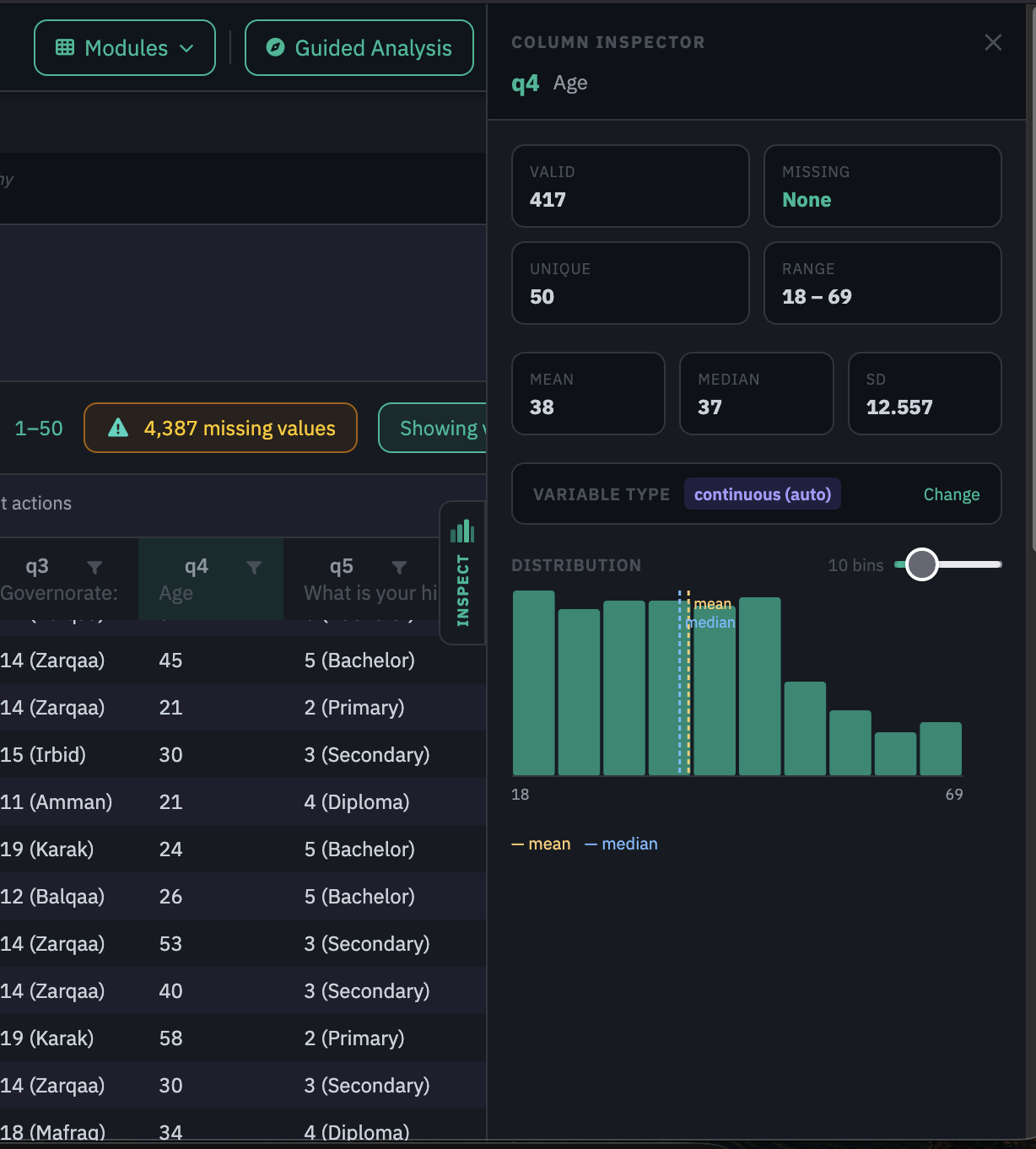
The inspector shows a binned histogram with a Bins slider (5 to 40 bins) to adjust the level of detail in real time. A yellow dashed line marks the mean and a blue dashed line marks the median. When they sit close together, the distribution is roughly symmetric. When they diverge, the distribution is skewed, which is a sign to report the median rather than the mean and to think about non-parametric tests. Key statistics appear above the chart: valid count, missing count, unique values, range, mean, median, and standard deviation.
3.3Filtering rows — Column filters
Click the funnel icon in any column header to open a filter dropdown listing every distinct value with its count. Untick values to hide rows containing them. Filters across different columns work together: a row must satisfy every active filter to be shown. Column filters are view-only and have no effect on any analysis run in Descriptive Analysis or other modules.
3.4Exploring categorical variables — Frequency
The Column Inspector gives you a quick visual look at a variable. When you need the full picture with exact counts, valid percentages, and cumulative percentages, run Frequency in Descriptive Analysis.
- Select one or more categorical variables. Use the search box to find variables by name or label. A separate table is produced for each variable you select. Tick Select all to run every variable in one step.
- Decide whether to include missing values. Tick Include missing values to add a Missing row showing how many respondents did not answer.
- Add a chart (optional). Choose a bar, horizontal bar, or pie chart to accompany the table.
- Click Generate.
Reading a frequency table
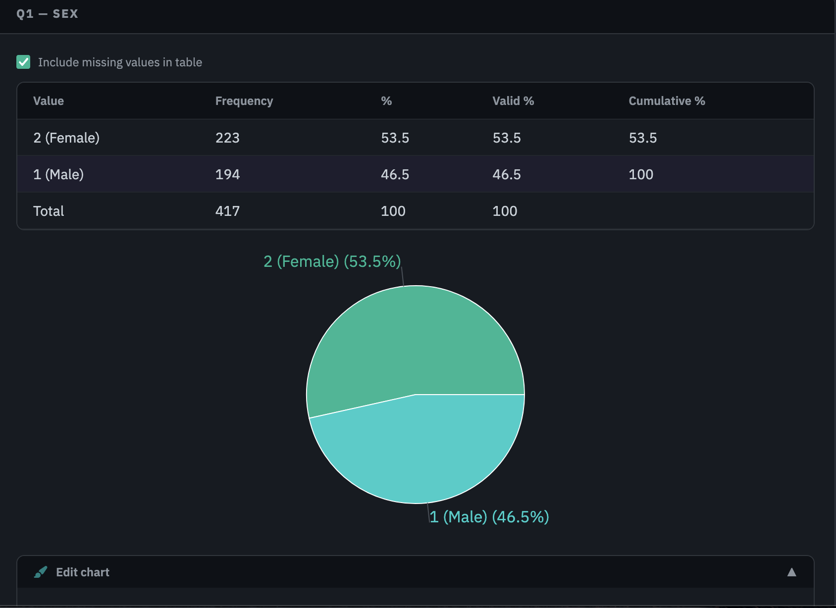
Each table has five columns: Value, Frequency, %, Valid %, and Cumulative %. The Valid % column divides each count by the number of non-missing responses only. This is almost always the figure to report, as it correctly describes the distribution among people who answered. The % column includes non-respondents in the denominator, which means it will be lower than Valid % whenever any responses are missing. Cumulative % is a running total of Valid %, useful for ordinal variables such as Likert scales where you want to say "68% rated the training as good or excellent".
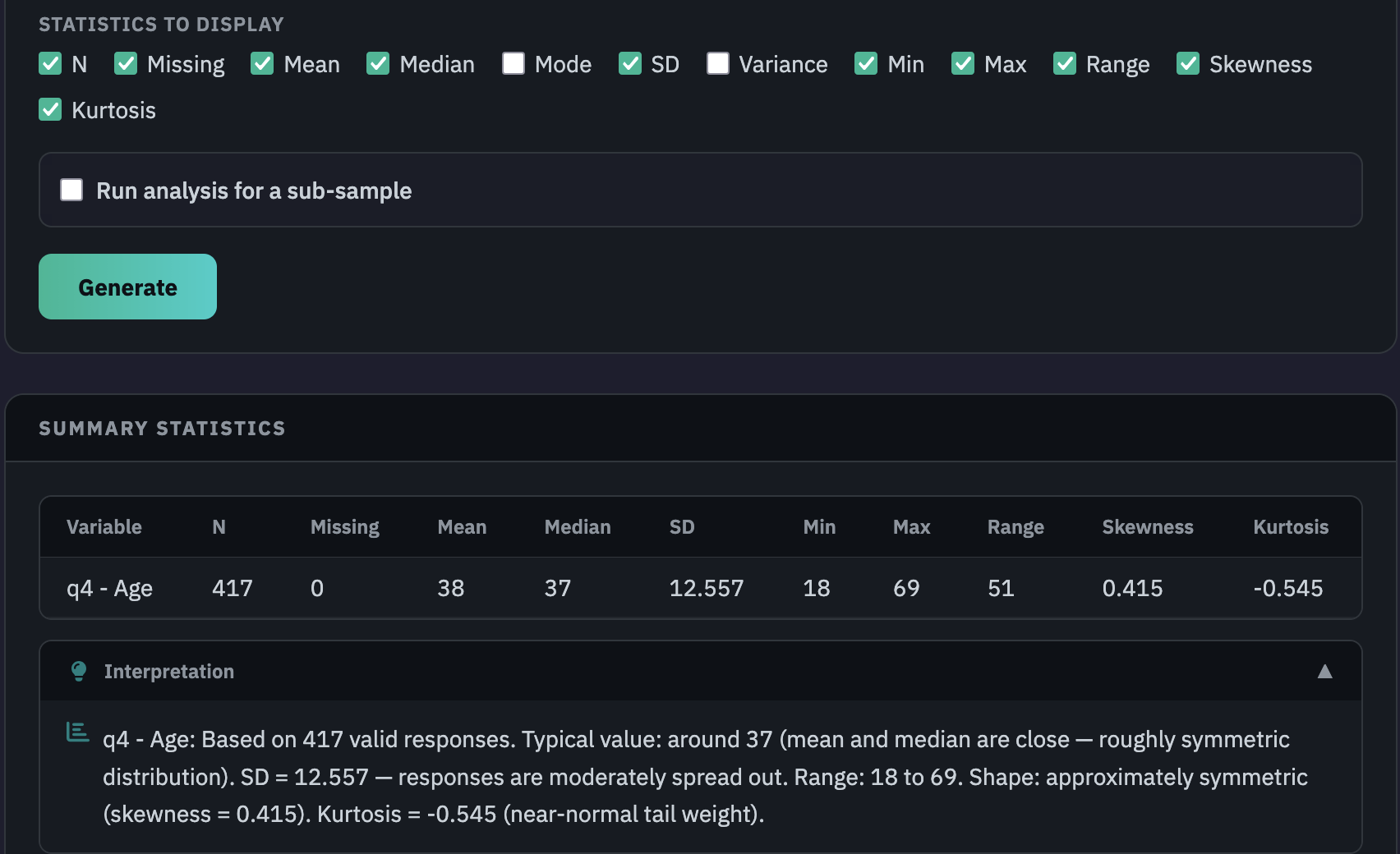
3.5Exploring numeric variables — Summary Statistics
For variables measured on a numeric scale, such as ages, scores, incomes, and durations, run Summary Statistics in Descriptive Analysis. While Frequency counts how often each value appears, Summary Statistics describes the shape of a numeric distribution: where values cluster, how spread out they are, and whether the distribution leans one way. These measures also inform which statistical tests are appropriate later in the analysis.
- Select one or more numeric variables. All selected variables appear in a single table, one row per variable.
- Add a grouping variable (optional). To compute statistics separately for each group, select a categorical variable from the Group by dropdown. Only categorical variables appear in this list. If the variable you want is not showing, change its type to categorical in Data Management or through the Column Inspector, then return to Summary Statistics.
- Choose which statistics to display. Available options include N, Missing, Mean, Median, Mode, SD, Variance, Min, Max, Range, Skewness, and Kurtosis. The default selection covers the most commonly reported measures.
- N and Missing: N is the number of rows with a valid (non-missing) value — the sample size that all other statistics are based on. Missing is the count of rows with no recorded value. Always check these first. A low N relative to your expected sample means the statistics describe a subset that may not be representative.
- Mean: The arithmetic average — all values summed and divided by the count. It is sensitive to extreme values. A single very high or very low response pulls the mean away from where most respondents sit, which is why it should not be reported alone when the distribution is skewed.
- Median: The middle value when all responses are sorted from lowest to highest — half fall above it, half below. Unlike the mean, the median is not affected by extreme values. When mean and median diverge noticeably, the distribution is skewed and the median is the more reliable description of the typical respondent.
- Standard deviation (SD): A measure of how far individual values typically spread around the mean. A small SD means values cluster tightly; a large SD means they range widely. As a rough guide, in a roughly normal distribution about two-thirds of values fall within one SD of the mean.
- Min and Max: The smallest and largest values in the column. Always worth checking — an impossible minimum or maximum (an age of 0, a score of 9,999) is almost certainly a data entry error that should be corrected before any analysis runs.
- Skewness: A measure of the distribution's asymmetry. A value near zero means the distribution is roughly symmetric. A positive value means a long tail to the right — most values cluster at the lower end with a few very high ones pulling the mean up. A negative value means the opposite. Values above 1 or below -1 indicate meaningful skew that affects the choice of statistical test. When skewness is high, consider non-parametric alternatives in the Inferential module: Mann-Whitney U instead of a t-test, or Kruskal-Wallis instead of ANOVA.
- Kurtosis: A measure of tail weight relative to a normal distribution. High kurtosis means heavier-than-normal tails — more extreme values than you would typically expect. Low kurtosis means values cluster more tightly near the centre with lighter tails. Most evaluation datasets do not require deep attention to kurtosis unless you are running tests that are sensitive to distributional shape.
- Apply a subsample filter (optional). To restrict the analysis to a specific subgroup, apply a filter and set the conditions.
- Click Generate.
3.6Exploring relationships between categorical variables — Cross-Tabulate
After looking at individual variables, it is useful to ask whether two categorical variables are related to each other. A frequency table tells you how one variable is distributed. A cross-tabulation shows how that distribution changes, or stays the same, when you look at it through a second variable.
Cross-Tabulate in Descriptive Analysis places two variables in a grid, with the categories of one as rows and the categories of the other as columns, and counts how many respondents fall into each combination. If the distribution of the row variable looks roughly the same across every column group, the two variables are probably unrelated. If it shifts noticeably, there is likely a relationship worth looking into.
Some questions it can answer: do women and men participate in the programme at similar rates? Does satisfaction vary across districts? Are education levels distributed differently between the intervention and control groups? All of these are questions about whether one categorical variable behaves differently depending on the value of another.
- Select the variable on the side (rows). This is typically the outcome or the variable you want to describe. Its distinct values will appear as row labels down the left side of the table.
- Select the variable at the top (columns). This is typically the grouping variable. Its distinct values will appear as column headers across the top.
- Choose the percentage type. Column % is the most common choice. It shows the distribution of the row variable within each column group, so you can compare across groups by reading down each column. Row % answers a different question: what proportion of each row category falls into each column group.
- Include missing values (optional). Tick Include missing values to include non-responses as a visible category in the table.
- Run for a subset (optional). Tick Run analysis for a sub-sample to generate the table for a specific subgroup.
- Click Generate.
Reading the output
The table shows counts and percentages in each cell. The last row and column show the marginal totals. Below the table, two statistics describe the relationship:
- Chi-square (χ²) and p-value. The chi-square test compares the counts you observed with the counts you would expect if the two variables were completely unrelated. A p-value below 0.05 is generally taken as evidence of a real relationship. For a full explanation of the test and how to interpret the results, see How to Perform a Chi-Square Test.
- Cramér's V. A measure of how strong the relationship is, on a scale from 0 (no relationship) to 1 (perfect relationship). Unlike chi-square, Cramér's V does not grow with sample size, so it gives a clearer sense of practical significance. As a rough guide: below 0.10 is negligible, 0.10 to 0.29 is small to moderate, and 0.30 and above is strong.
Exploring data in AnalyZ Solutions through Column Inspector, Frequency, Summary Statistics, and Cross-Tabulate.
04Common mistakes to watch for
- Starting analysis without exploring first. Running a test on a variable you have not looked at is how problems get missed. Spend a few minutes in Data View before opening any analysis function.
- Confusing column filters with subsample filters. Column filters in Data View change the display only. To restrict an analysis to a subgroup, use the Subsample Filter inside the relevant function.
- Not checking variable types before analysis. A variable in the wrong analytical picker will be handled incorrectly throughout. Check types in the Column Inspector before running any formal analysis.
- Reporting % instead of Valid %. When missing responses are present, % gives lower figures than the true proportions among those who answered. Always report Valid %.
- Reporting only the mean for skewed distributions. Income, expenditure, and time-to-event variables are almost always right-skewed. Report mean and median together, or the median alone when skew is high.
- Using Cross-Tabulate for numeric variables. Cross-Tabulate works with two categorical variables only. For comparing a numeric variable across groups, use Summary Statistics with a grouping variable instead.
Do column filters in Data View affect my analysis results?
When should I use the Column Inspector versus running Frequency?
My grouping variable does not appear in the Group by dropdown in Summary Statistics. Why?
The mean and median for my variable are very different. What does that tell me?
When should I use Cross-Tabulate versus Summary Statistics for group comparisons?
What is the difference between a variable label and a value label?
Ready to explore your data?
Open Data View in AnalyZ Solutions. Free to sign up, free to analyze.
Get started