Choosing the Right Chart Type
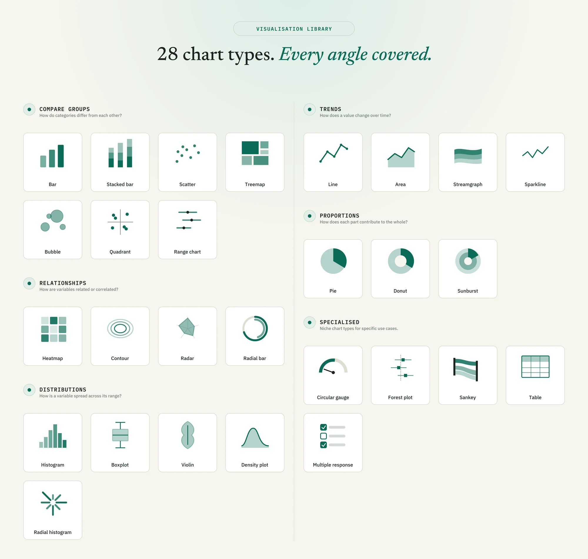
Chart type selection starts with a question, not a preference. This guide maps all 28 chart types in AnalyZ Solutions to the analytical question each one is built to answer.
The most important decision in data visualization is not which chart looks best — it is which chart answers the question your audience is actually asking. A bar chart and a pie chart can display the same numbers, but they invite completely different readings. This guide explains how to work from your question to the right chart type, then covers all six groups and 28 chart types available in AnalyZ Solutions with guidance on when each one applies and when it does not.
01Start with the question, not the chart
Every chart type is optimised for a particular kind of comparison. Using the wrong type does not just make a chart harder to read — it can actively mislead. A stacked bar chart that adds up to more than 100% suggests parts of a whole, even if the data does not work that way. A line chart connecting survey responses from disconnected regions implies continuity that does not exist. These are not aesthetic errors; they are analytical ones.
The most reliable way to avoid them is to decide what question your chart needs to answer before choosing the type. There are six fundamental questions that chart types are built around, and they map directly to the six groups in AnalyZ Solutions.
| If your question is... | The group to use |
|---|---|
| How do categories differ from each other? | Compare groups |
| How does a value change over time? | Trends |
| How does each part contribute to the whole? | Proportions |
| How are two or more variables related or correlated? | Relationships |
| How is a variable spread across its range? | Distributions |
| A niche format for a specific analytical task | Specialised |
Once you have identified the group, the choice within it comes down to the structure of your data: how many variables are involved, whether one of them is continuous or categorical, and how much detail your audience needs to see.
02The six groups in detail
Use this group when your primary goal is showing that one category has more, less, or a different composition than another. The x-axis (or equivalent) is almost always a categorical variable — region, programme type, age group, response option — and the y-axis is a quantity being compared across those categories.
- Bar The default for comparing a single numeric value across categories. Horizontal bars work better when category labels are long; vertical bars are conventional for time-ordered categories.
- Stacked bar Adds a second categorical dimension within each bar, showing both the total and its composition. Best when the sub-categories add up to a meaningful whole and there are no more than four or five sub-categories.
- Scatter Plots two numeric variables simultaneously, one per axis. Shows how individual observations are distributed across two dimensions and whether a relationship appears to exist between them.
- Treemap Encodes quantity as tile area. Useful when comparing many categories at once and relative size is more important than precise values. Difficult to read for small differences.
- Bubble Extends scatter by adding a third variable encoded as bubble size. Effective for showing three dimensions at once but requires careful sizing so bubble areas are not misread.
- Quadrant Divides a scatter plot into four zones using threshold lines on both axes. Useful for categorising observations into high/low combinations — for example, high reach but low quality.
- Range chart Shows the minimum, maximum, or confidence interval for each category rather than a single value. Use when communicating uncertainty or spread across groups is as important as the central estimate.
Use this group when one axis represents time and the shape of the change — the rise, fall, plateau, or fluctuation — is the primary thing to communicate. Connecting points with a line implies that the progression between them is continuous and meaningful; only use trend charts when time is genuinely ordered and the gaps between points are comparable.
- Line The standard for a single value tracked over time. Multiple lines on the same chart can show how two or three groups evolve in parallel, though more than four lines becomes hard to read.
- Area A line chart with the area below the line filled in. Emphasises cumulative volume rather than the trajectory itself. Stacked area charts show how multiple series combine over time.
- Streamgraph A flowing, stacked area chart centred on a baseline rather than zero. Effective for showing how the composition of a total shifts over time. Better for exploration than for precise reading.
- Sparkline A small, stripped-down trend line intended to be read in context alongside text or a table rather than as a standalone chart. Shows shape and direction without axis labels or titles.
Use this group only when the parts genuinely add up to a meaningful whole — typically 100% of something. If you are comparing absolute values rather than shares, a bar chart from the Compare groups section is almost always clearer. Proportion charts lose their meaning when the categories do not sum to a coherent total.
- Pie Divides a circle into slices by share. Works well with two to four categories. Beyond that, slices become too small to read reliably, and a bar chart showing percentages is more legible.
- Donut A pie chart with a hollow centre, which can display a summary figure. Often easier to read than a full pie because area comparisons are slightly clearer along the arc. The same category-count limitations apply.
- Sunburst A multi-level donut that shows hierarchical proportions — for example, region broken down by district, then by programme. Useful for communicating nested structure, but difficult to read precisely for more than two levels.
Use this group when the goal is showing how two or more variables covary — whether they rise and fall together, whether certain combinations cluster, or whether one pattern repeats across multiple dimensions. These charts tend to require more data literacy to read correctly than comparison or proportion charts.
- Heatmap Encodes values in a grid using colour intensity. Excellent for showing patterns across two categorical dimensions simultaneously — for example, response rates by region and month, or correlation matrices between multiple variables.
- Contour Shows the density of observations across two continuous variables as concentric bands, similar to a topographic map. Useful when a scatter plot has too many overlapping points to read clearly.
- Radar Plots multiple variables on axes radiating from a centre point, with values connected to form a polygon. Useful for comparing a small number of entities across several dimensions simultaneously — for example, a programme assessed on five quality criteria.
- Radial bar A bar chart wrapped into a circular layout. Primarily aesthetic; the circular arrangement makes precise comparison harder than a standard bar chart. Best used when visual impact matters more than exact readability.
Use this group when the shape of the data matters as much as its central value. A mean alone does not show whether responses cluster tightly or spread widely, whether the distribution is symmetric or skewed, or whether there are outliers. Distribution charts make these features visible.
- Histogram Divides a continuous variable into bins and counts observations in each. The most direct way to see the overall shape of a distribution — whether it is roughly normal, skewed, bimodal, or has gaps.
- Boxplot Shows median, interquartile range, and outliers in a compact format. Particularly useful for comparing distributions across two or more groups on the same axis, where individual histograms would be harder to align.
- Violin Combines a boxplot with a smoothed density curve, showing both the summary statistics and the full shape of the distribution. More informative than a boxplot alone, but less familiar to non-specialist audiences.
- Density plot A smoothed version of a histogram. Shows the distribution as a continuous curve rather than discrete bins, making the overall shape easier to read. Multiple density curves can be overlaid for group comparisons.
- Radial histogram A histogram arranged in a circular layout, with bins radiating outward. Suited specifically to cyclic data — hours of the day, days of the week, compass bearings — where the wrap-around structure of the variable matters.
These chart types do not fit neatly into the five question categories above because each one is designed for a particular analytical task. Use them when the task matches; do not adapt them to purposes they were not designed for.
- Circular gauge Displays a single value against a target or scale. Effective for dashboards where a KPI needs to communicate at a glance — coverage rate against a target threshold, for example. Requires a meaningful reference value to be useful.
- Forest plot Displays effect sizes and confidence intervals from multiple studies or subgroups on a single axis. Standard in systematic reviews and meta-analyses. Requires effect estimates and their intervals as inputs.
- Sankey Shows flows between categories — how people, resources, or responses move from one state or group to another. Useful for tracking programme pathways, referral routes, or budget allocations across stages.
- Table A structured grid of values. Not a chart in the traditional sense, but useful inside dashboards when exact figures matter more than visual pattern. Best used alongside charts, not as a replacement for them.
- Multiple response Designed specifically for survey questions where respondents could select more than one answer. Handles the fact that percentages in a multiple-response question sum to more than 100%, which standard bar charts misrepresent.
03Common mistakes to avoid
Using a pie chart when a bar chart would be clearer
Humans judge lengths more accurately than angles or areas. A bar chart showing five categories as percentages is almost always easier to read than a pie chart of the same data, particularly when the values are close to each other. Pie charts should be reserved for cases where the part-to-whole relationship is genuinely the message, and where there are no more than four or five clearly distinct slices.
Connecting discrete categories with a line
A line implies continuity. If your x-axis categories are survey sites, programme types, or administrative regions, a line chart suggests there is a meaningful progression between them that does not exist. Use a bar chart instead. Reserve line charts for time series and other genuinely ordered, continuous sequences.
Using stacked bars when parts cannot be summed
A stacked bar chart suggests that the sub-categories add up to a meaningful total. If each sub-category is independently measured, for example coverage rates for separate interventions rather than sub-categories of one intervention, stacking them misrepresents the data structure. Use grouped bars or separate charts instead.
Overloading a chart with too many series
More than four or five lines on a line chart, or more than five slices on a pie chart, typically produces a chart where no individual series can be read clearly. Consider splitting into multiple small charts, filtering to the most relevant series, or switching to a heatmap or table if many categories must be compared simultaneously.
Choosing a chart type for its visual novelty
A radar chart, a streamgraph, or a sunburst may attract attention, but if the audience cannot read it accurately, the chart has failed regardless of how it looks. In research and evaluation contexts, where credibility depends on the audience trusting the figures they see, a conventional chart type read with confidence is always preferable to an unfamiliar one read with uncertainty.
What is the difference between a bar chart and a histogram?
When should I use a boxplot rather than showing means?
Can I use a pie chart if my values do not add up to 100%?
What chart type should I use for a multiple-response survey question?
What is the right chart for showing effect sizes from a programme evaluation?
How many chart types should a single dashboard contain?
Ready to build your first chart?
Open Data Visualization in AnalyZ Solutions. All 28 chart types, free to use.
Get started