How to Build Charts and Share a Dashboard
A guide to building charts and sharing a dashboard in AnalyZ Solutions.
AnalyZ Solutions lets you go from a dataset to a shareable, filterable dashboard in a single session. This guide walks through every step, from picking a chart type and generating a chart, to assembling a multi-chart dashboard, generating plain-English interpretations for all charts at once, and publishing a public link that your audience can explore live, no login required. The privacy model that makes this safe to share is explained along the way.
01Charts and dashboards: the basics
A chart is a visual representation of data. Instead of reading through rows of numbers, a chart lets you see patterns, comparisons, and distributions at a glance. A bar chart shows how a quantity differs across categories. A line chart shows how something changes over time. A pie or donut chart shows how a whole is divided into parts. The choice of chart type shapes what your audience notices first, which makes selecting the right one as important as the data itself.
Charts become more powerful when they are grouped together. A single chart can answer one question. A collection of charts, a dashboard, can answer several related questions at once and reveal how different variables in a dataset relate to each other. A dashboard intended for sharing goes one step further: it lets your audience explore the data on their own terms, applying filters and viewing the results in real time, without needing access to the underlying spreadsheet or any technical tools.
When a dashboard is the right output
A dashboard is useful when the audience needs to explore, not just read. If you are presenting findings to a single, fixed audience with a specific conclusion, a report or slide deck may be the better format. A dashboard is the stronger choice in these situations:
- The audience wants to filter by their own subgroup. A programme team in one region wants to see their region's figures. A donor wants to compare two target groups. A dashboard with filter controls lets each reader do this without asking for a custom export.
- The findings cover multiple dimensions simultaneously. When a dataset has geographic, demographic, and outcome variables that all matter, a single chart cannot show all of them. A dashboard with five or six charts lets the reader hold the full picture at once.
- The data will be updated and re-shared. A dashboard link stays constant. When you update the data and republish, the same URL reflects the new figures, without sending a new file to everyone who received the original.
- The audience is non-technical. A well-designed dashboard requires no software, no login, and no data skills from the person viewing it. Anyone with the link can read and interact with it.
28 chart types across six groups
AnalyZ Solutions includes 28 chart types organised into six question-based groups. The group a chart belongs to tells you the kind of question it is built to answer.
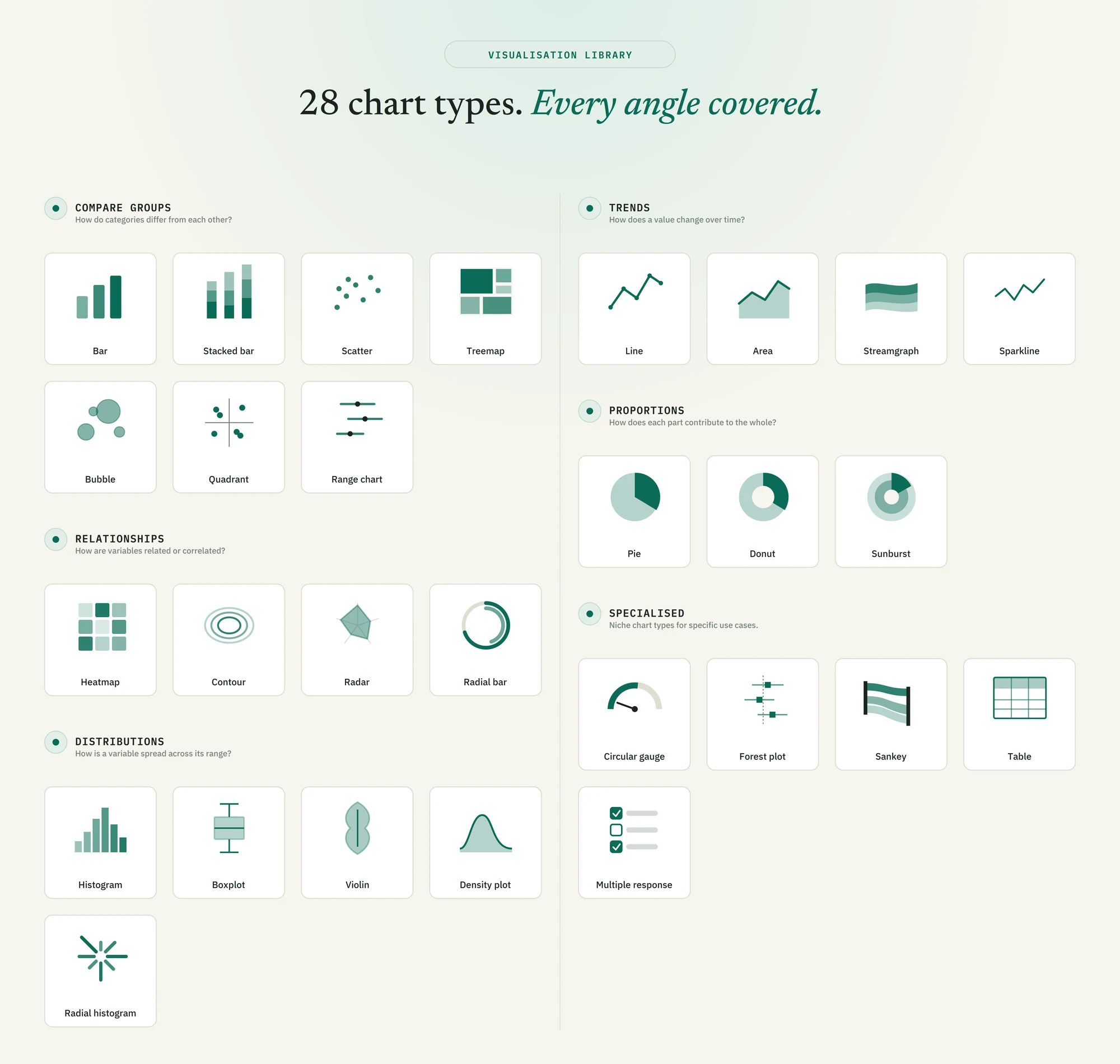
The six groups and the questions they address are:
- Compare groups — How do categories differ from each other? Bar, Stacked bar, Scatter, Treemap, Bubble, Quadrant, Range chart.
- Trends — How does a value change over time? Line, Area, Streamgraph, Sparkline.
- Proportions — How does each part contribute to the whole? Pie, Donut, Sunburst.
- Relationships — How are variables related or correlated? Heatmap, Contour, Radar, Radial bar.
- Distributions — How is a variable spread across its range? Histogram, Boxplot, Violin, Density plot, Radial histogram.
- Specialised — Niche chart types for specific use cases. Circular gauge, Forest plot, Sankey, Table, Multiple response.
Start by deciding which question your chart needs to answer. Then pick a group, and choose the chart type within it that best fits your data structure and audience.
02Creating a chart
Every dashboard starts with individual charts. Charts are built inside the Data Visualization module, which is accessible directly from the main navigation or through the Quantitative Analysis section.
Where to start
Navigate to Data Visualization. The left-side panel lists all available chart types, organised into groups: Compare groups, Trends, Proportions, Relationships, Distributions, and Specialised. Pick the chart type that fits your question. In the example in the video, a vertical bar chart is used to show how a single variable is distributed across categories.
Specifying variables
Once you have selected a chart type, the configuration panel on the right asks for the variable you want to plot. For a bar chart that is the category axis. If you want to compare across a second dimension, for example to see how the distribution differs between two subgroups, you can also specify a split-by variable. The split-by field is optional; if you leave it blank, the chart uses only the primary variable.
Generating and refining the chart
Click Generate. The chart appears in the preview area immediately. If you want to adjust how it looks before saving it, an editing panel lets you change colours, axis labels, legend position, and titles. No knowledge of charting libraries or code is needed for any of this.
Adding the chart to the dashboard
Once the chart looks right, click Add to Dashboard. The chart is stored in the current session dashboard. Repeat the process to build additional charts. There is no limit on how many charts you can add in a session, and you can mix chart types freely.
03Working in dashboard view
Once you have added at least one chart to the dashboard, click View Dashboard to switch from the chart builder to the full dashboard layout. All charts sit together on a single page. You can return to the builder at any time to add or edit charts.
Interpret All
The most time-saving feature in dashboard view is Interpret All. A single click sends every chart in the dashboard to AnalyZense and generates a plain-English summary for each one. You do not have to write any analysis yourself, and you do not have to interpret charts one by one. The interpretations appear underneath each chart in the dashboard view.
Cross-filtering
In dashboard view you can also click on any bar, slice, or point to cross-filter the entire dashboard. All other charts update to reflect only the rows that match your selection. This lets you explore subgroup patterns interactively without rebuilding any charts.
04Saving and sharing the dashboard
When you are ready to share, click Save and Share. A modal opens with a short set of options before the link is generated.
- Give the dashboard a name. This is the internal name you will see when you load the dashboard in a future session.
- Write a short public title. This is the title shown to people you share the link with. It can be the same as the name, or a more descriptive heading suited for a public audience.
- Choose whether the dashboard is public. Public dashboards are accessible by anyone with the link. Private dashboards can only be viewed by you. You can toggle this setting at any time after saving, without generating a new link.
- Select the filter variables. Before publishing, you choose which variables viewers are allowed to filter by when they open the public link. This gives your audience a degree of interactivity, for example filtering by region or programme type, without giving them access to the underlying data.
- Click Save Dashboard. A shareable link is generated and displayed. Copy the link and share it with your audience. The link works immediately with no login required on the recipient's side.
Watch how to create charts and publish a dashboard in AnalyZ Solutions.
What the public view looks like
When someone opens the shared link, they see all the charts and their interpretations laid out exactly as you designed them. The filter controls you enabled are visible in a panel, and they can apply them live to explore the data from different angles. They cannot see the raw dataset, edit any chart, or access any part of the platform they have not been given access to.
05Privacy: what is and is not shared
The privacy model is central to how AnalyZ Solutions works, and it is worth being explicit about what happens at each stage.
06When to use a dashboard versus Sense Making or Data Canvas
AnalyZ Solutions offers three ways to present charts beyond the chart builder itself, and they serve different purposes.
- Dashboard is the right choice when your audience needs to explore the data themselves. It provides a live, filterable view of multiple charts with a public link, and does not require a slide or document format.
- Sense Making is better suited when you want a structured, slide-based output with AI-generated narrative. Each chart becomes a slide with an interpretation already written. This is closer to a finished report or presentation than an interactive exploratory tool.
- Data Canvas gives you a freeform layout for mixing charts, text, and other visual elements into a designed page. It is the most flexible format and is well suited for printed reports or polished one-page outputs.
These destinations are not mutually exclusive. The same chart can be added to the dashboard, sent to Sense Making, and placed on the canvas in the same session.
Can I add the same chart to the dashboard and to Sense Making at the same time?
How many charts can I add to a single dashboard?
Can I change the dashboard from public to private after publishing?
Do recipients of the public link need an AnalyZ Solutions account?
Does my raw data get uploaded anywhere when I save a dashboard?
Can I edit charts after the dashboard has been saved?
What does cross-filtering do, and does it affect the shared link?
Ready to build your first dashboard?
Open Data Visualization in AnalyZ Solutions. Free to sign up, free to analyze.
Get started